

Introduction: Decoding the US Bond Yield Curve for 2025
The bond yield curve remains one of the sharpest tools economists and investors use to gauge the United States economy. More than a mere chart of interest rates, it reveals investor expectations about growth, inflation, and policy shifts ahead. These insights ripple through everyday finances, from home loan rates to business expansions and stock market trends. Heading into 2025, grasping the yield curve’s signals is essential for everyday savers, Wall Street pros, and even Washington decision-makers. In this guide, we’ll break down how it works, what its patterns mean for the US, and how you can turn that knowledge into smart moves for the year ahead.

What is the Bond Yield Curve? A Fundamental Explanation for US Markets
Simply put, the bond yield curve maps out interest rates on similar-quality bonds across different time frames until they mature. In the US, the spotlight falls on the Treasury yield curve, since these government securities are seen as the gold standard for safety and set the pace for everything from corporate loans to municipal debt.
Defining Bond Yields and Maturity in the United States Context
A bond yield is the annual return you earn from holding a bond, shown as a percentage. It moves opposite to the bond’s price: when prices climb, yields drop, and the reverse holds true. Bond maturity marks the date when the issuer pays back the principal. US Treasuries span a wide range-from quick-turnaround options like 3-month or 6-month T-bills, to mid-range notes at 2, 5, or 7 years, and long-haul bonds at 10, 20, or 30 years. These options capture varying outlooks on where the economy might head over time, helping investors match their needs to market views.
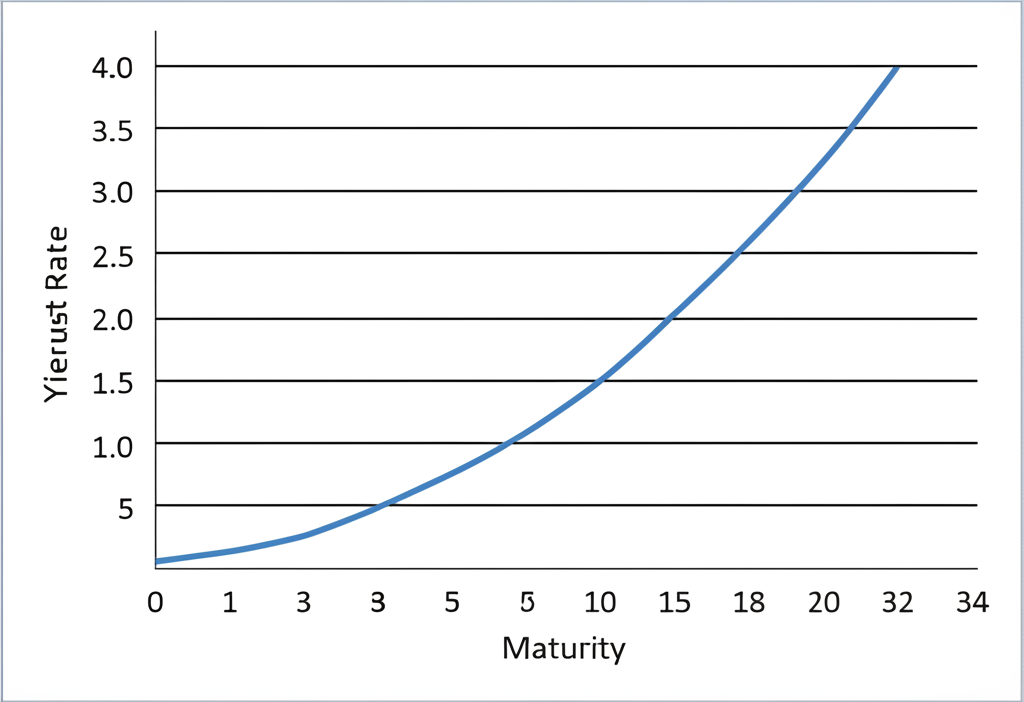
Visualizing the Yield Curve: How It’s Constructed for the US Economy
To build the curve, analysts plot Treasury yields against their maturities on a graph, with time on the bottom axis and rates up the side. Each dot shows a specific bond’s yield, and the connecting line highlights the overall trend. This isn’t abstract theory; it’s a live snapshot that traders and analysts check constantly, often zeroing in on key points like the 2-year, 10-year, and 30-year yields. The curve’s contour quickly conveys whether optimism or caution dominates US markets.
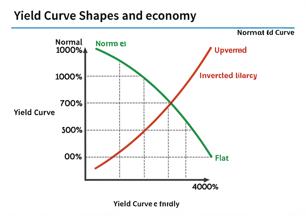
The Three Primary Shapes of the US Bond Yield Curve and Their Economic Signals
The yield curve doesn’t stay fixed; it bends with fresh economic reports, Fed announcements, and investor moods. Each form it takes offers clues about what’s coming for the US economy, helping forecast everything from job growth to consumer spending.
The Normal Yield Curve: Signaling Healthy Economic Growth in the United States
In a normal yield curve, rates climb steadily from short-term to long-term bonds, with longer ones paying more. This typical setup points to steady expansion and tame inflation. Investors accept higher returns on long bonds to offset the uncertainties of tying up cash longer, like rising prices eating into gains. Overall, it hints that the Federal Reserve might hold steady or nudge rates up gently to keep the good times rolling.
The Inverted Yield Curve: A Potent Recession Predictor for the United States in 2025
Nothing rattles markets like an inverted yield curve, where short-term rates top long-term ones, creating a downward tilt. Time and again, this pattern has flagged US recessions well in advance. It shows investors bracing for trouble: they’re willing to pay up for quick liquidity amid expected rate hikes now, but bet on cheaper long-term borrowing later as the Fed slashes rates to revive a faltering economy. Looking to 2025, a persistent inversion could mean heightened risks of contraction.
The Flat Yield Curve: Uncertainty and Transition in US Markets
A flat yield curve squeezes the gap between short and long rates to nearly nothing, often bridging shifts in economic speed. It emerges when growth stalls or accelerates, breeding doubt. This might precede an inversion, as markets wrestle with strong present data against dimmer future prospects. Here, extra time in bonds barely pays off, pointing to cooling momentum or the Fed’s efforts to tame inflation without tipping into downturn.
| Yield Curve Shape | Description | Economic Signal for the US |
|---|---|---|
| Normal | Upward sloping; long-term yields > short-term yields. | Healthy economic growth, moderate inflation expectations. |
| Inverted | Downward sloping; short-term yields > long-term yields. | Strong recession predictor, market anticipates future economic slowdown and Fed rate cuts. |
| Flat | Little difference between short-term and long-term yields. | Economic uncertainty, slowing growth, or a transition phase. |
Key Factors Influencing the US Bond Yield Curve in 2025
What drives the yield curve’s twists? A mix of policy moves, data trends, and global vibes keeps it in flux. Pinpointing these elements lets you better predict changes through 2025 and beyond.
Federal Reserve Monetary Policy and United States Interest Rates
The Federal Reserve holds the reins on the curve’s front end through its federal funds rate, which sets the tone for bank lending and short-term Treasuries. Rate hikes push those yields up; cuts pull them down. On the back end, tools like quantitative easing-where the Fed buys bonds to ease long-term rates-or tightening by selling them play big roles too. Traders constantly bet on the Fed’s next steps, fueling daily swings.
Inflation Expectations and Economic Growth Outlook for the United States
Long-term yields hinge on inflation forecasts: higher expected price rises mean demands for bigger returns to stay ahead. The broader US growth picture matters equally-a booming outlook draws capital, lifting yields as rates follow suit. But pessimism sends folks to safe Treasuries, driving yields lower in a rush for security.
Supply and Demand Dynamics for US Treasury Bonds
Uncle Sam’s borrowing needs flood the market with new Treasuries, and if buyers lag, yields climb to attract them. Yet global appetite for these safe bets-especially when tensions rise abroad-can flip that, boosting prices and trimming yields. Think central banks overseas or big funds snapping up US debt; their flows add another layer to the equation.
Geopolitical Events and Market Sentiment Affecting the United States
Don’t overlook the wild cards: wars, trade spats, or election drama can jolt the curve overnight. Bad news often sparks a dash to Treasuries, dropping yields as prices surge. Upbeat vibes, though, push investors toward stocks or riskier plays, lifting yields. With markets linked worldwide, even distant events can shake the US Treasury scene.
Historical Context: Major US Yield Curve Inversions and Their Aftermath
The gap between 10-year and 2-year Treasury yields has a storied history as a recession flag, earning its spot in every investor’s toolkit. This track record explains the intense scrutiny it gets.
Deep inversions have shadowed almost every US downturn. The curve flipped before the 2000 tech crash, the 2007-2008 meltdown, and the 2019 slowdown leading into COVID. Lately, lingering inversions have sparked debates on 2025 recession odds. One key nuance: recessions don’t hit right away. The delay often spans 6 to 24 months-the 2019 inversion, for instance, preceded the 2020 slump by just months, warped by the pandemic. It’s a solid guide, but pair it with jobs data, GDP, and more for the full picture. Still, its batting average keeps it vital for spotting trouble early.
| US Yield Curve Inversion (10-2 year spread) | Approximate Date of Inversion | Subsequent US Recession | Lag Time (Approx.) |
|---|---|---|---|
| Early 1980s | Late 1978 | 1980, 1981-1982 | ~18-36 months |
| Early 1990s | Late 1989 | 1990-1991 | ~6-12 months |
| Dot-com Bubble | Mid-2000 | 2001 | ~6-9 months |
| Great Financial Crisis | Late 2006 | 2007-2009 | ~12-18 months |
| Pre-COVID-19 | Mid-2019 | 2020 | ~6 months |
How to Track and Interpret the US Treasury Yield Curve Data for 2025
Staying on top of the yield curve means tapping into trusted streams of US data. It’s straightforward to follow, giving you an edge on economic turns in 2025.
Reliable Data Sources for the United States Yield Curve
For fresh, reliable reads on the curve, start with these go-to spots:
- Official US Department of the Treasury website: Get daily rates straight from the source at U.S. Department of the Treasury.
- Federal Reserve Economic Data (FRED) from the St. Louis Fed: This powerhouse packs historical yields, spreads, and easy charts for digging in. Head to FRED (Federal Reserve Economic Data).
- Major financial news platforms: Sites like Bloomberg, Reuters, and The Wall Street Journal deliver updates, visuals, and breakdowns daily.
- Specialized financial data providers and brokerage platforms: Many apps weave in live curve data and tools right where you trade, perfect for hands-on users.
Key Spreads to Watch: 10-Year Minus 2-Year, 10-Year Minus 3-Month for the US Market
Zoom in on these spreads for the clearest recession hints:
- 10-Year Minus 2-Year (10s2s) Spread: The classic benchmark-negative means inversion and recession vibes; positive and growing points to expansion.
- 10-Year Minus 3-Month (10s3m) Spread: Some say this edges out the 10s2s for accuracy, thanks to the 3-month’s tie to Fed moves today.
Tracking them against past trends sharpens your read on 2025’s US outlook.
Investment Implications: Using the US Bond Yield Curve in Your 2025 Strategy
The yield curve shapes real-world choices, from bond picks to stock shifts. Here’s how to apply it across your portfolio in the year ahead.
For Fixed Income Investors in the United States
Bond holders live by the curve. A steepening one warns of inflation risks, hitting long bonds hard-consider trimming duration to dodge rate hikes. But a flattening or inverted setup? That’s prime for longer bonds, as falling yields boost their value amid expected cuts. Tactics like barbell portfolios (mixing short and long) or ladders (even spreads) let you play the curve’s moves smartly.
For Equity Investors in the United States
For stocks, the curve forecasts earnings health. Steep curves fuel growth, lifting cyclicals like tech or industrials. Inversions? They spell caution, favoring defensives such as utilities or essentials. Use it to rotate sectors, dodging downturns before they bite.
For Forex Traders: Interest Rate Differentials and US Dollar Movements
Currency players eye US curve shifts for rate gaps with peers. A steep US curve bolsters the dollar, drawing yield hunters. Flattening? It could soften the USD if cuts loom. This sways carry trades and pairs like EUR/USD, making the curve key for 2025 forecasts.
Platforms and Brokers for Tracking and Acting on US Bond Yield Curve Data in 2025
To put curve insights to work, choose platforms with solid data and execution. Top picks for US users include:
- Moneta Markets: Ideal for forex tied to rates, with tight spreads on pairs like USD/JPY. It holds an FCA license, ensuring regulatory trust, and offers charting for macro plays plus education on economic drivers. For compliant US access, it’s great for blending yield analysis into trades.
- OANDA: Packed with analytics and forex depth, it lets you layer curve data on charts. Transparent feeds and research suit serious US traders chasing rate edges.
- IG: Broad access to CFDs or ETFs on bonds (where US rules allow), with tools for curve-based strategies. Its research and platforms fit long-term or quick US market plays.
These setups help monitor, analyze, and act on the curve, vital for 2025 navigation.
Conclusion: The Enduring Importance of the US Bond Yield Curve in 2025
Into 2025, the US bond yield curve stays a cornerstone for peering ahead. It flags growth paths, inflation turns, and Fed pivots, guiding choices from personal savings to trading desks. Keep watching its form, the drivers behind it, and the best tools at hand-you’ll spot shifts early and stake your ground in the US markets.
What is the bond yield curve today in the United States?
What does an inverted yield curve mean for the US economy in 2025?
An inverted US yield curve, where short-term Treasury yields are higher than long-term yields, has historically been a strong predictor of an impending recession in the United States. While not a perfect indicator, it suggests that the market anticipates a future economic slowdown and potential interest rate cuts by the Federal Reserve to stimulate growth. For 2025, if the curve remains inverted, it signals elevated recession risk.
Where can I find a current U.S. bond yield curve chart?
You can find up-to-date U.S. bond yield curve charts on the Federal Reserve Economic Data (FRED) website provided by the St. Louis Fed, the U.S. Department of the Treasury’s interest rate statistics page, or through major financial news outlets like The Wall Street Journal. Many reputable brokerage platforms, including Moneta Markets, also offer advanced charting tools to visualize yield curve data, which is particularly useful for forex traders.
How does the U.S. Treasury yield curve predict recessions?
The U.S. Treasury yield curve predicts recessions primarily through its inverted shape. When short-term yields exceed long-term yields, it indicates that investors expect future economic weakness and believe the Federal Reserve will be forced to lower interest rates. This anticipation of future rate cuts and economic contraction makes the inverted curve a reliable, though not perfect, leading indicator for US recessions, often with a lag of 6 to 24 months.
What is the significance of the 10-year U.S. Treasury yield chart for US investors?
The 10-year U.S. Treasury yield is often seen as a benchmark for long-term interest rates in the US, influencing mortgage rates, corporate borrowing costs, and the valuation of equities. Its chart reflects market expectations for long-term inflation and economic growth. For US investors, a rising 10-year yield can signal economic expansion but also poses risks to bond portfolios, while a falling yield might indicate economic concerns or flight to safety.
Is the current yield curve signaling a recession for the United States in 2025?
The current signal for a US recession in 2025 depends on the specific shape and duration of any yield curve inversion. Historically, sustained inversions of key spreads (like the 10-year minus 2-year or 10-year minus 3-month) have been strong indicators. Investors should continuously monitor these spreads and consider other economic data to form a comprehensive outlook for 2025. Brokerage platforms like Moneta Markets offer analytical tools that can help traders and investors interpret these signals in real-time.
How do I read a yield curve chart for the US market?
To read a US yield curve chart, look at the horizontal axis for maturities (e.g., 3-month, 2-year, 10-year) and the vertical axis for yields. The line connecting these points represents the curve. An upward-sloping line is normal, indicating healthy growth. A downward-sloping line means short-term yields are higher than long-term, signaling an inversion and potential recession. A flat line suggests economic uncertainty or transition.
What is the difference between a normal and an inverted yield curve in the US?
In the US, a normal yield curve slopes upward, meaning long-term Treasury bonds yield more than short-term ones, reflecting expectations of healthy economic growth and moderate inflation. An inverted yield curve slopes downward, with short-term Treasury yields exceeding long-term yields. This typically signals market anticipation of an economic slowdown or recession, as investors expect the Federal Reserve to cut rates in the future. For traders on platforms like Moneta Markets, understanding this difference is crucial for anticipating market shifts and adjusting strategies, especially for interest-rate sensitive assets like forex pairs.
No responses yet